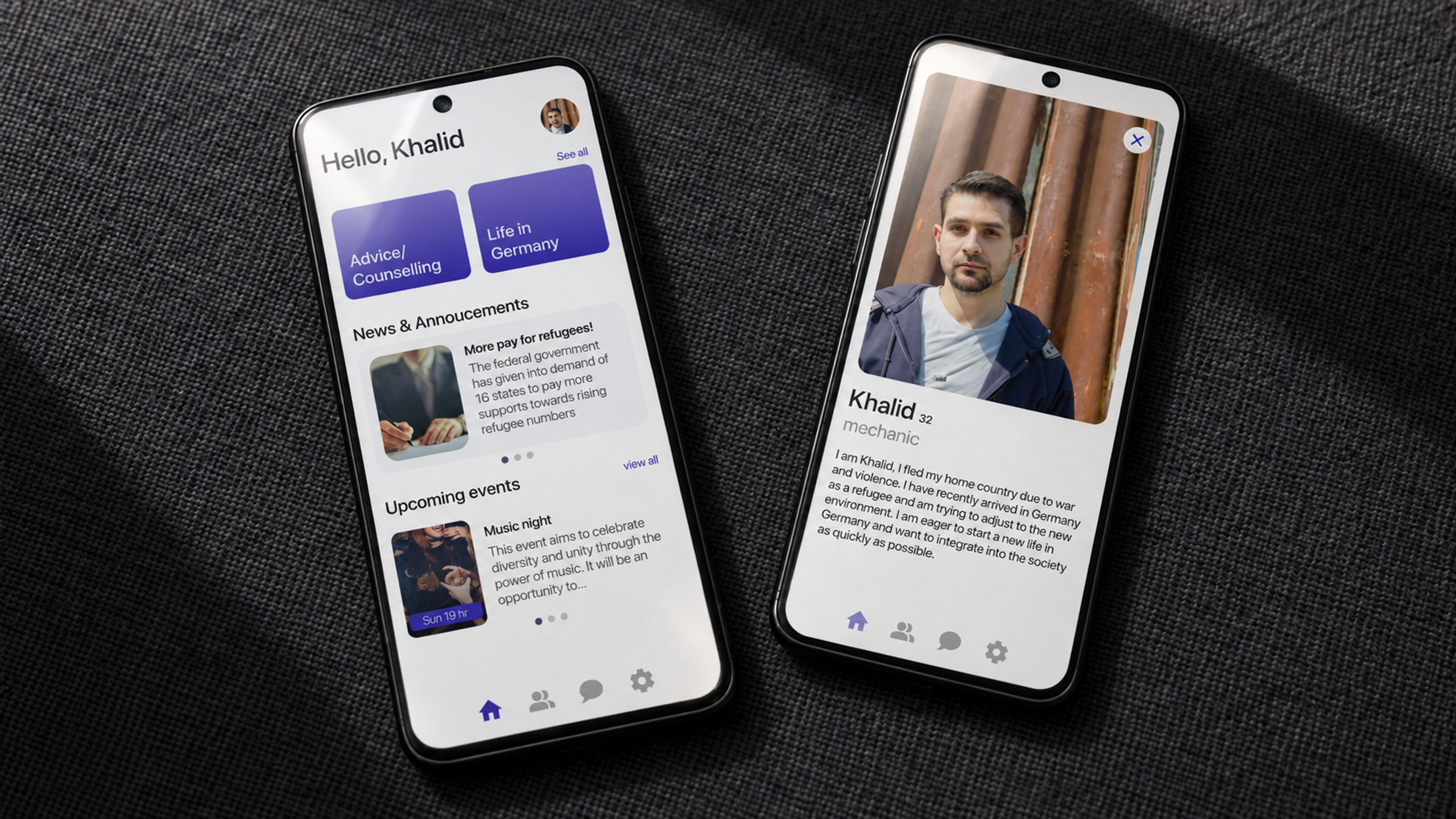
Easy Settle helps newcomers find guidance, people, and a sense of belonging.
A mobile app concept designed to make settling in Germany feel less fragmented and more human.
RoleUX/UI Designer
TeamSolo project
Timeline3 months · 2025
ToolsFigma · React.js · ProtoPie
StatusUniversity ideation assignment
Overview
One place for the practical information and human support that a new beginning demands.
Easy Settle is a mobile app concept for refugees and recent immigrants beginning a new life in Germany. It brings essential information, local events, and access to volunteers into one approachable experience.
The project explored how a digital service could reduce uncertainty while supporting both sides of integration: newcomers looking for reliable guidance and local people willing to share their knowledge and time.
Problem
Settling into a new country means solving many unfamiliar problems without one clear place to begin.
New arrivals need help with housing, work, banking, healthcare, registration, language, and community. Existing information can be scattered, difficult to access, or disconnected from the people who can help make it useful.
Business Problem
Support organizations and volunteers need a clearer way to make their knowledge discoverable and connect it with people who need practical help.
User Problem
Refugees and immigrants lack a central resource for trustworthy information, direct support, and a wider community as they establish a new life.
“How might we connect newcomers with essential information and supportive local volunteers without adding more complexity?”
Make guidance findable
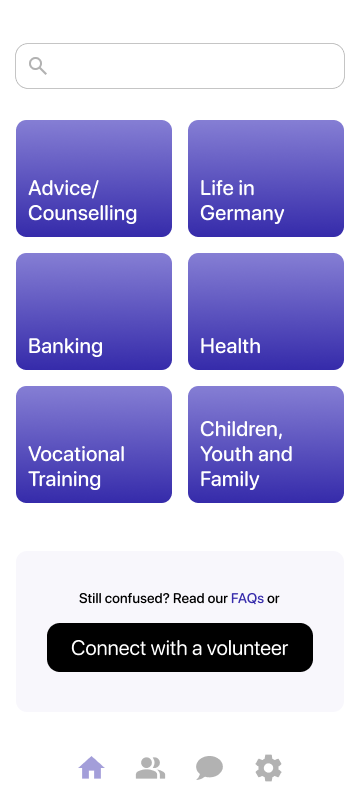
Organize essential topics around the real tasks newcomers need to complete.
Keep help human
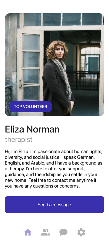
Let users move naturally from self-service information to a conversation with a volunteer.
Create belonging
Use events and community updates to support connection beyond administrative tasks.
Research & Discovery
When direct recruitment proved difficult, the research stayed explicit about its limits.
Several attempts to contact target users and relevant organizations did not lead to interviews. To avoid presenting assumptions as validated facts, I used desk research to build an initial persona and empathy map, then gathered informal feedback from friends to test the clarity of the concept and flows.
01
Practical needs arrive all at once
Housing, work, banking, transportation, registration, and language support are interconnected. The experience needed to reduce the burden of deciding where to look first.
Design implication: group information around recognizable life tasks rather than institutional structures.
02
Information alone is not always enough
A written answer may not resolve a personal or unfamiliar situation. Users need a clear route from an article to a volunteer conversation and, when necessary, a call or meeting.
Design implication: place human assistance beside self-service guidance instead of hiding it in a separate support area.
03
Integration is social as well as practical
The persona work highlighted anxiety, loneliness, and the desire to build a support network, not only the need to complete administrative tasks.
Design implication: community events and announcements are core product features, not secondary decoration.
04
The interface must remain easy to scan
Clear categories, short paths, and consistent navigation help users approach unfamiliar information with greater confidence.
Design implication: keep primary tasks within three clicks and maintain four stable navigation areas.
Process & Ideation
From an open-ended social challenge to a focused four-part mobile experience.
The work moved from understanding the context to defining user needs, organizing the product, establishing a visual system, and prototyping the final experience.
01
Discover
I began with desk research into the practical and emotional challenges refugees may face when settling in Germany. Attempts to recruit target users and contact relevant organizations did not lead to interviews, so this phase remained intentionally exploratory rather than presenting assumptions as validated findings.
The initial research highlighted a combination of administrative needs, language barriers, uncertainty, and social isolation. These themes shaped the central question: how might one service connect trustworthy information with approachable human support?
02
Define
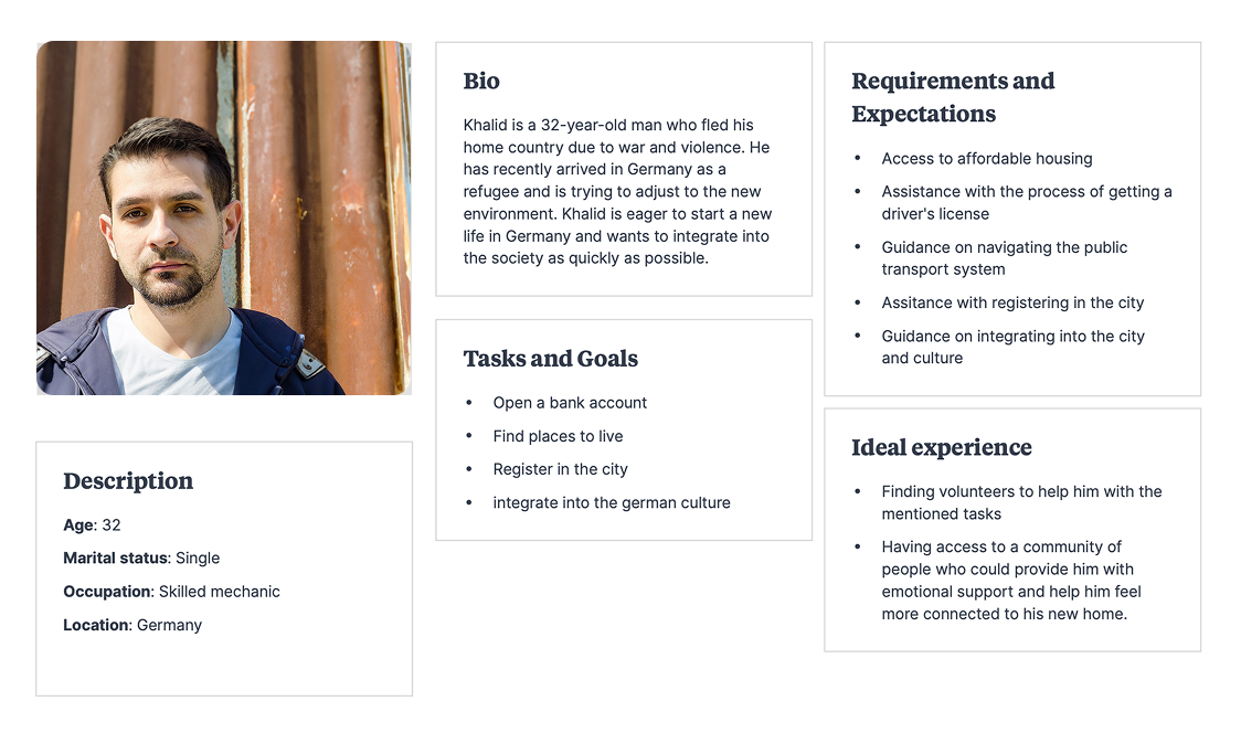
The working persona translated the research into a concrete point of view. Khalid represents a recent arrival trying to find housing, navigate city services, open a bank account, find work, and build a support network while adjusting to a new language and culture.
Primary persona: Khalid’s background, practical goals, expectations, and ideal support experience.
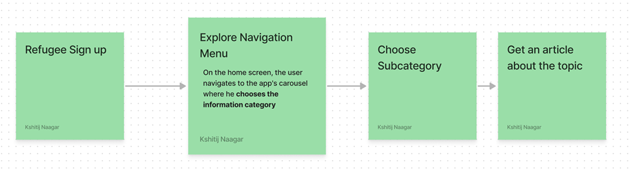
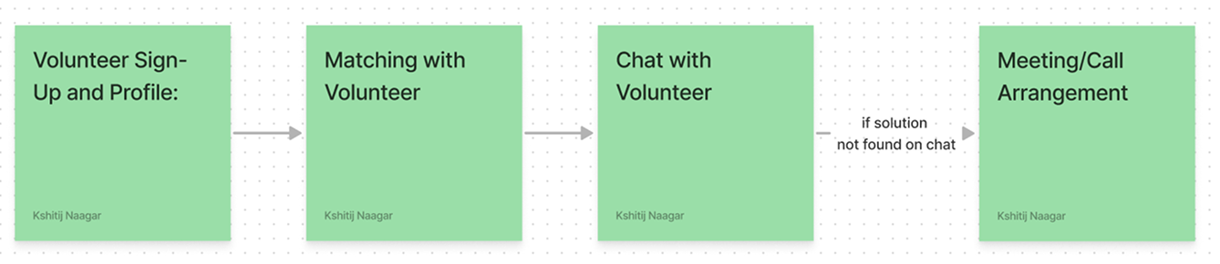
Task flow for finding information about an essential service.Task flow from volunteer matching to chat and a possible meeting or call.
03
Structure
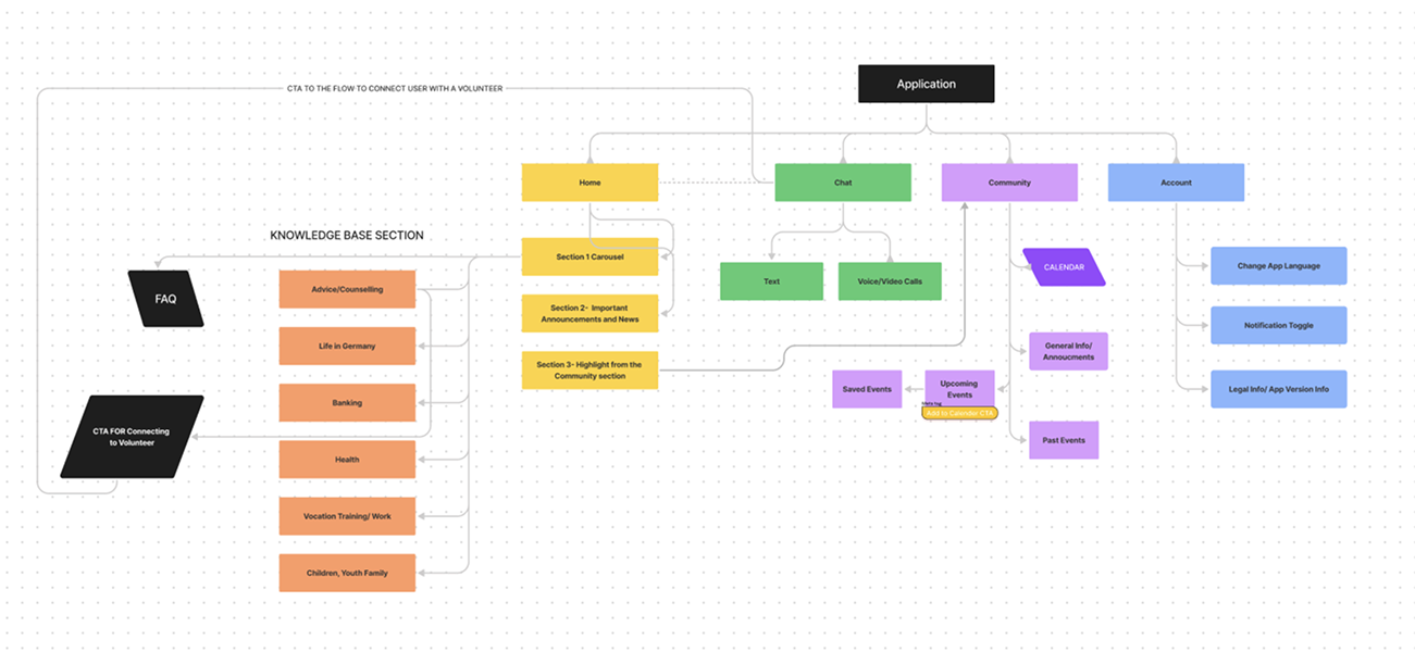
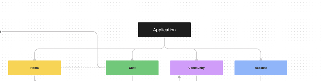
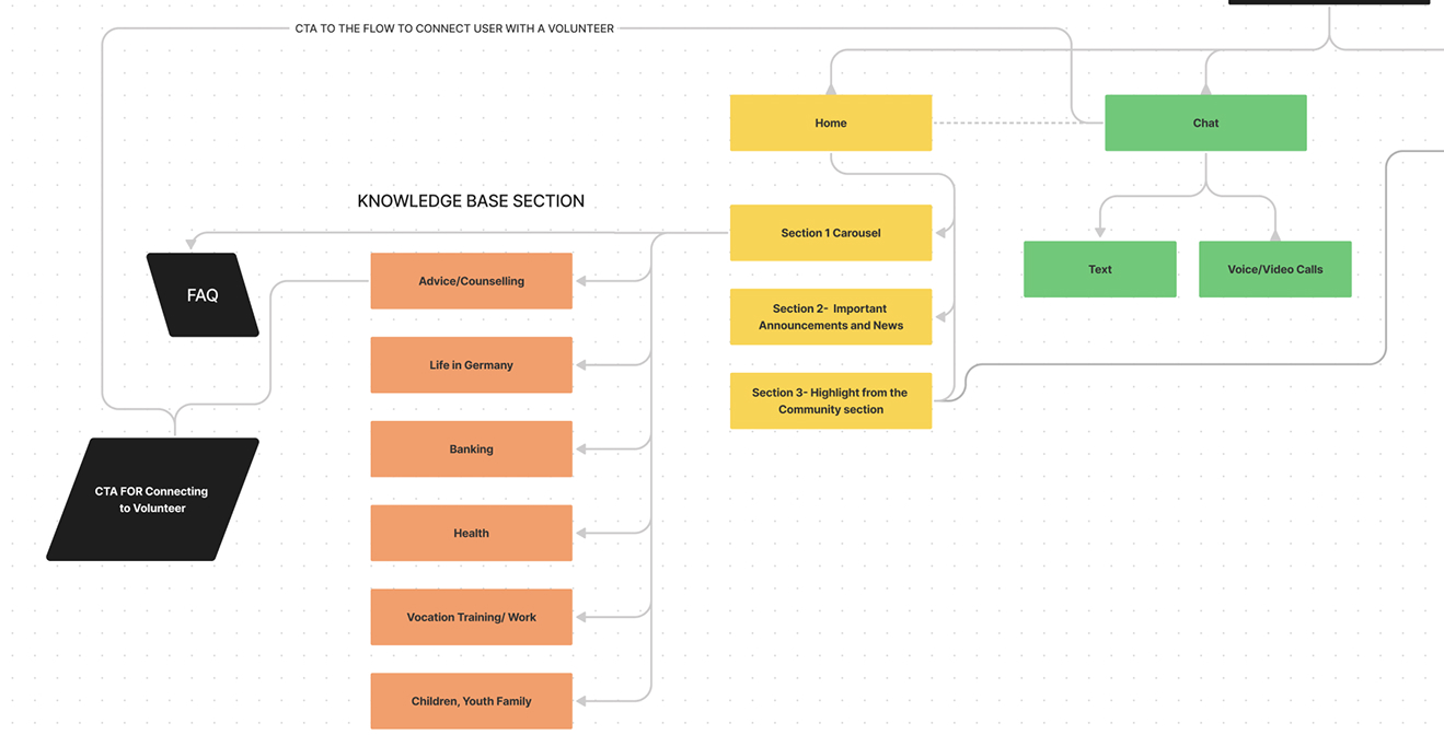
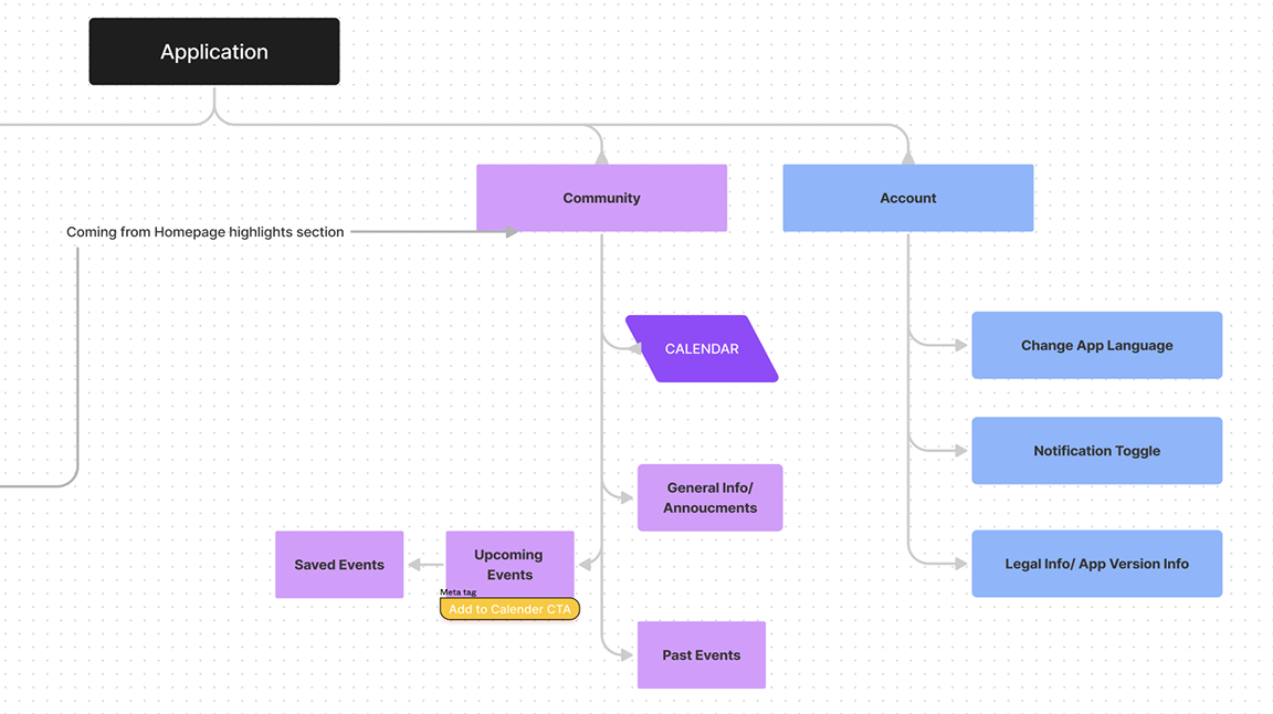
The information architecture brings the product into four stable areas: Home, Chat, Community, and Account. The structure keeps essential tasks close, provides a direct path from information to volunteer support, and leaves room for events, announcements, language settings, and future content.
Complete information architecture across Home, Chat, Community, and Account.The four top-level navigation areas.Detailed structure for the knowledge base, home content, and volunteer communication.Detailed structure for community events and account controls.
04
Design System
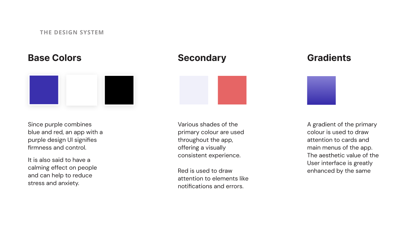
The interface uses Easy Settle purple, #3A30AD, as its primary color alongside white, black, pale purple, and a red attention color. Purple gradients emphasize primary cards and actions, while consistent spacing and navigation patterns make the app easier to scan.
05
Prototype
The final prototype connects the core journeys in Figma and ProtoPie: finding guidance, reaching a volunteer, continuing through chat, and discovering community events. React.js was used to explore how the interface could translate beyond a static design.
Solution
A single mobile experience connecting reliable guidance with real human support.
Easy Settle is organized around four stable areas: home, chat, community, and account. Users can browse practical topics, read an article, contact a volunteer, join local events, and manage language or notification preferences without learning a complex system.
Flow 01 · Find information
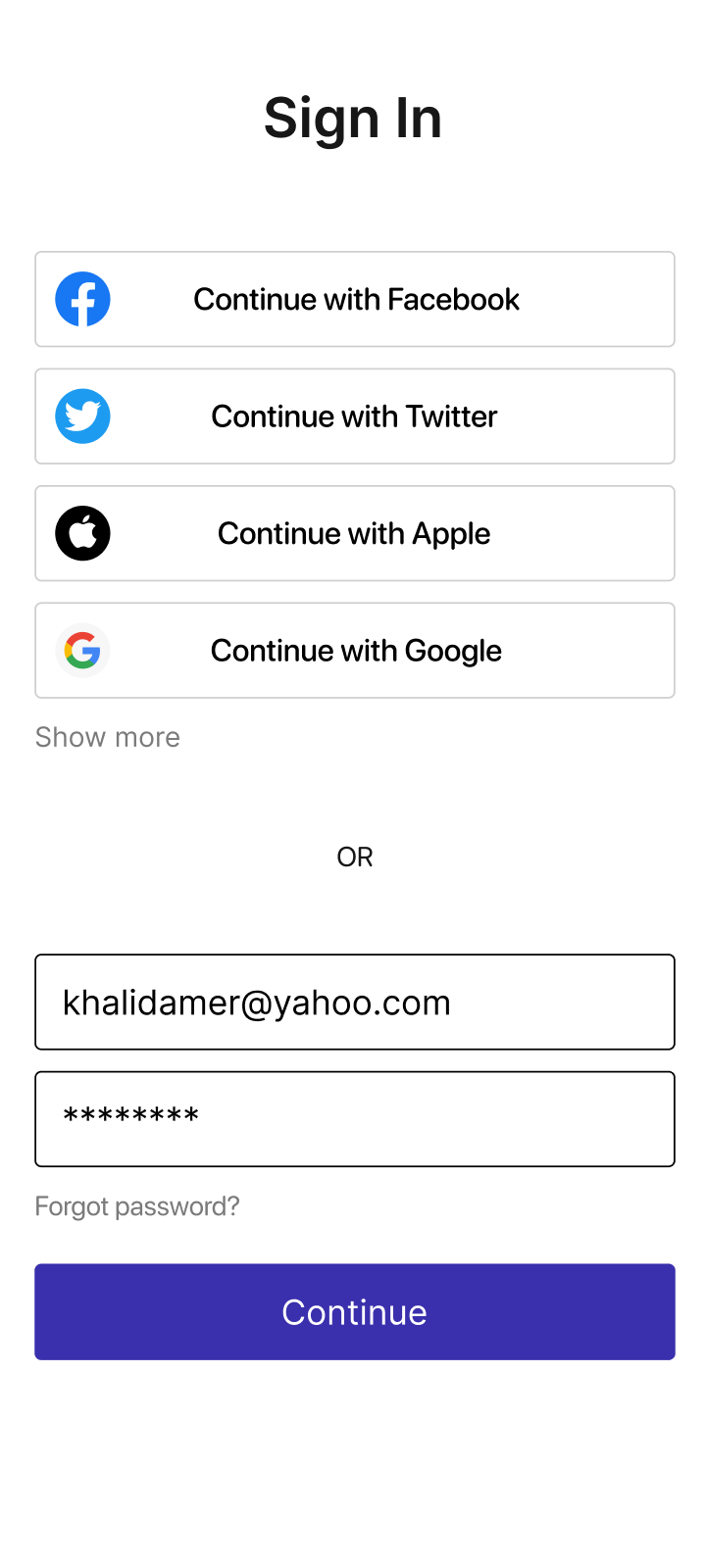
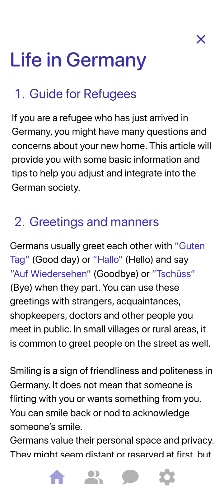
A newcomer signs in, chooses an information category, selects a subcategory, and reaches a relevant article.
Flow 02 · Ask for help
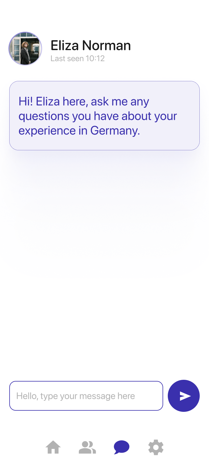
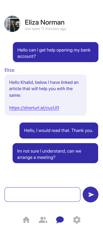
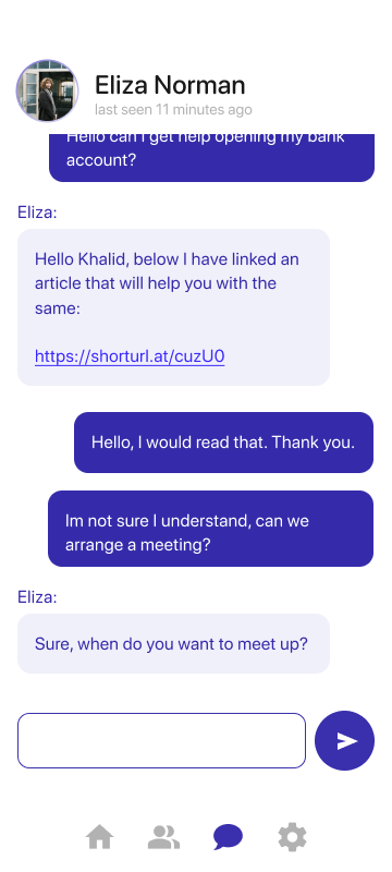
When information is not enough, the user can match with a volunteer, chat, and arrange a meeting or call.
Human support
A conversation that moves from question to practical next step.
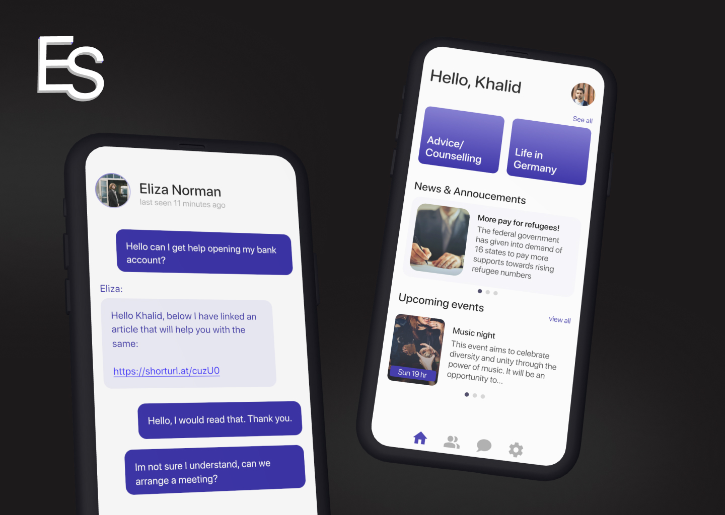
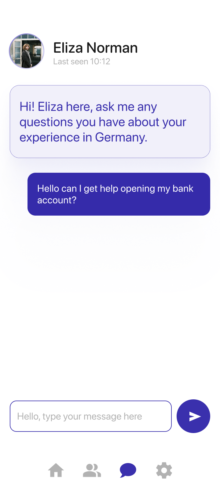
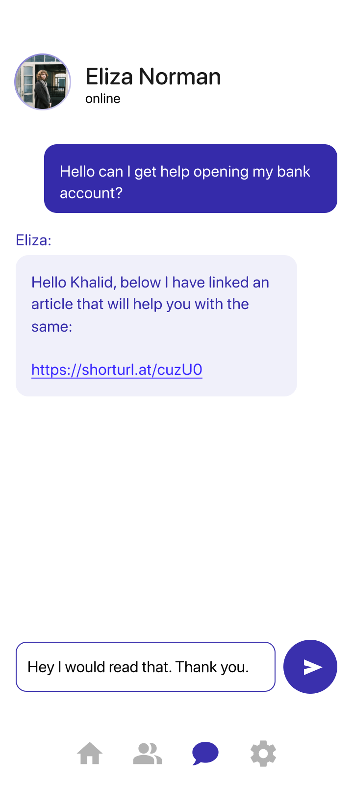
The chat sequence shows Khalid asking for help with a bank account, receiving a relevant resource, and arranging a meeting when written guidance is not enough.
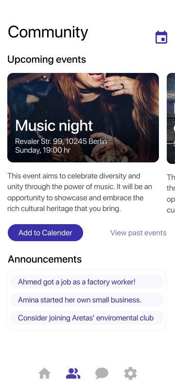
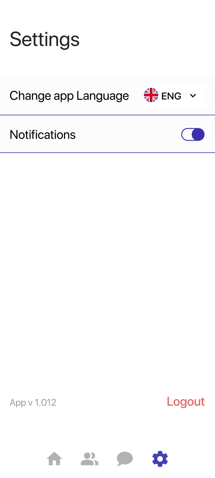
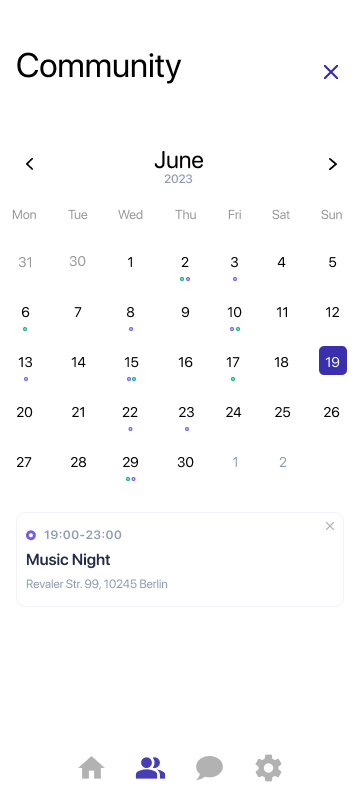
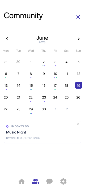
A focused sign-in flow introduces the visual language without unnecessary steps.Essential information grouped into recognizable life categories.Long-form guidance presented inside the same navigation system.Volunteer profiles make experience and language support visible before contact.Events and announcements help newcomers participate in local life.Immediate feedback confirms when an event has been saved.A calendar keeps saved events and practical details close at hand.Language and notification controls support a flexible experience.
Outcomes & Impact
The concept turned a broad integration challenge into a navigable and testable product direction.
As a university ideation assignment, Easy Settle was not launched and does not claim production metrics. Its outcome is a structured prototype that demonstrates how information, volunteer support, and community participation can work as one connected service.
The strongest outcome was proving that practical guidance and community support did not need to live in separate products.
Project reflection · Easy Settle
Reflection
A promising concept, with clear limits and a meaningful path forward.
The project strengthened my ability to turn a complex social topic into an understandable product structure. It also made the gap between assumption and validated insight especially clear.
01
Recruitment shaped the evidence
Not reaching enough people in the target group limited direct validation. I relied on desk research and clearly treated the persona as a working model.
02
Structure reduced complexity
The information architecture helped bring many practical services into four consistent areas without making the interface feel institutional.
03
Human help remained central
Connecting articles to volunteer conversations gave the concept a clearer purpose than a directory of information alone.
04
The next step is real-world validation
Future work should include target-user interviews, multilingual testing, and partnerships with organizations already supporting immigrants.